
AM Craft Mobile App
My Role
Product Designer, UX Researcher
Timeline
2 weeks (December 2023 - January 2024)
Tools Used
Figma, Adobe Photoshop
Background
The AM Craft is a local cafe near my college campus that I and many others love going to. They have great drinks and snacks at affordable prices. However, one major issue that comes up with ordering at the cafe is between classes, especially around lunchtime, a buildup of foot traffic causes long lines which results in a delay of a customer getting their order. Since the AM Craft only takes in person orders, their main customer base of college students with busy schedules may take their business elsewhere to restaurants and cafes with more convenient ordering options. Noticing this issue, I consulted the business owners about this issue and we identified one primary problem.
Problem
The AM Craft lacking an option to order ahead of time makes purchasing from the cafe inconvenient for busy customers and incentivizes them to order from competing cafes.
Solution
AM Craft Mobile App
The AM Craft Mobile app allows customers working around a busy schedule to seamlessly order their favorite items on the go. The app features familiar interactions, order customization and integrates the Google Maps API to create a smooth, efficient user journey both in and out of the app.
User Research
Primary Research Goals
How effective would a mobile ordering system be in increasing order volume compared to other solutions such as getting the AM Craft’s products on apps like DoorDash or Uber Eats?
What makes local competitors more or less appealing than the AM Craft?
Business Goals:
What would my target users of college students and coffee lovers want out of a mobile ordering system?
How do I design a product that allows users to order their items as effortlessly as possible?
User Goals:
User Interviews
In order to obtain all the necessary information I would need to start designing, I created a list of questions intended to provide insights towards my research and design goals. I gathered a sample of 30 fellow frequent AM Craft customers and asked them these questions:
How old are you?
Do you prefer to order drinks and food in person or online?
What makes a digital ordering system appealing to you?
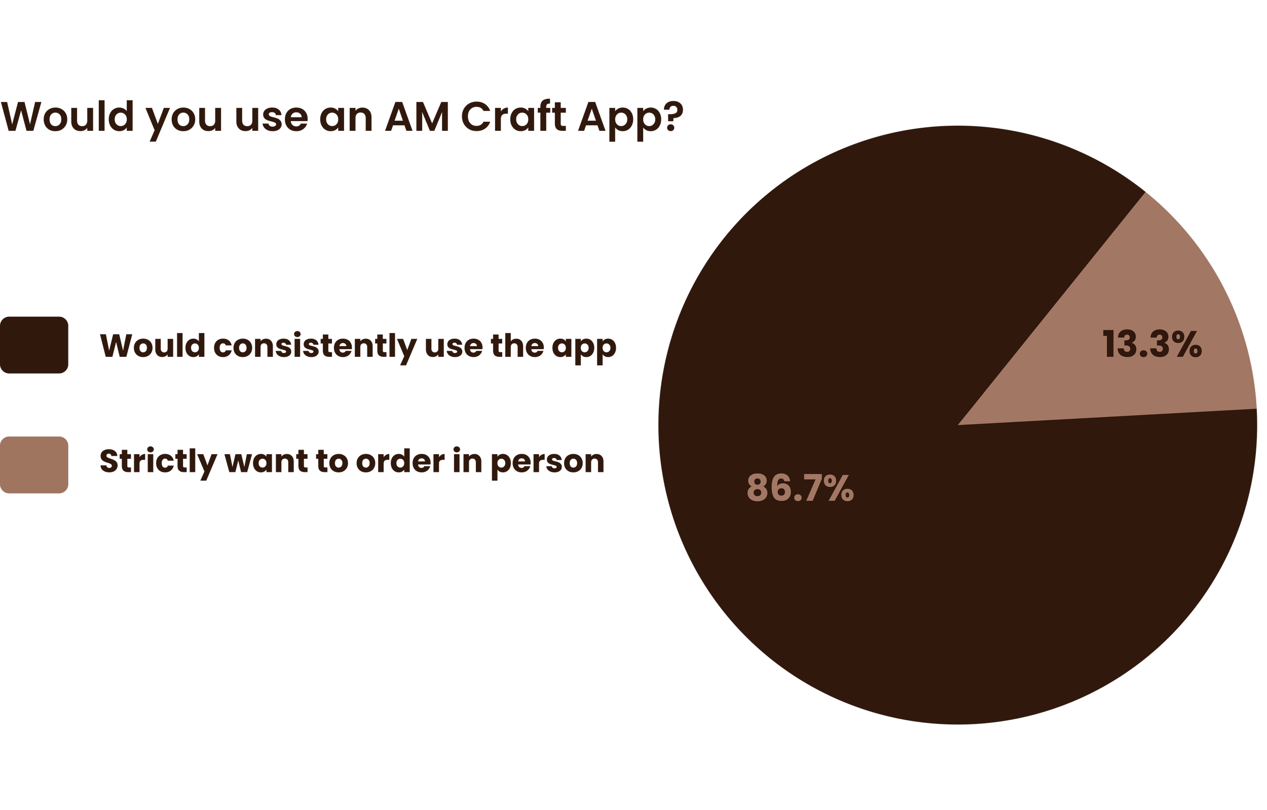
Would you be more likely to keep ordering from the AM Craft if they had online ordering?
User Interview Results


White Paper Research and Competitive Analysis
According to Lightspeed, a digital payment service, the ability for a customer to place an order through a mobile device can increase a customer’s average spend by 30%. Additionally, Starbucks reported that in 2021,
Online orders increase customer spend by 30%.
“Mobile orders represented 26% of U.S. company-operated transactions.”
The AM Craft’s business operations would benefit most, both from a profit and customer loyalty standpoint, from their own in-house mobile app as opposed to adding their items to food delivery apps. Realizing this, I analyzed the mobile ordering systems of competing options around campus to identify what made them successful.
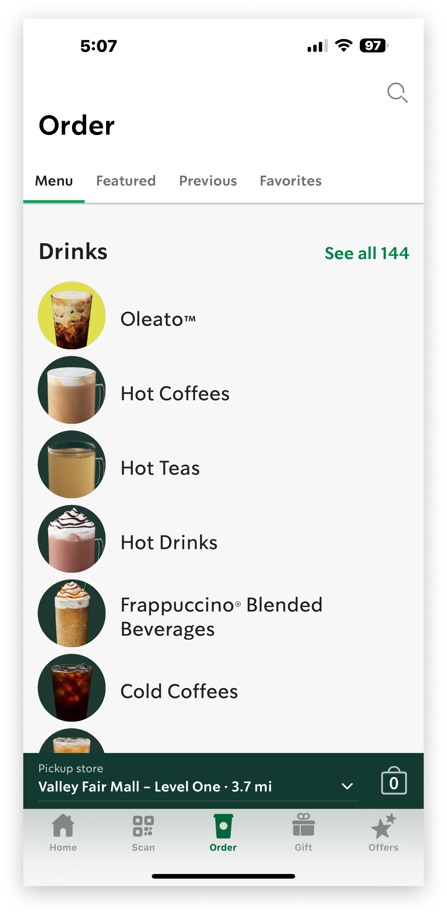
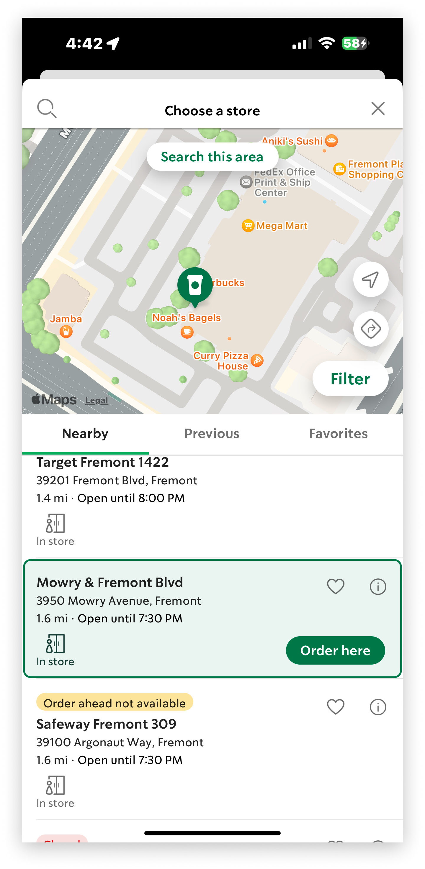

Starbucks
Intuitive and easy to use design
Favorites menu to allow users to reorder their favorite items easily
Integrated map to allow users to easily find a path to the store to pickup their order

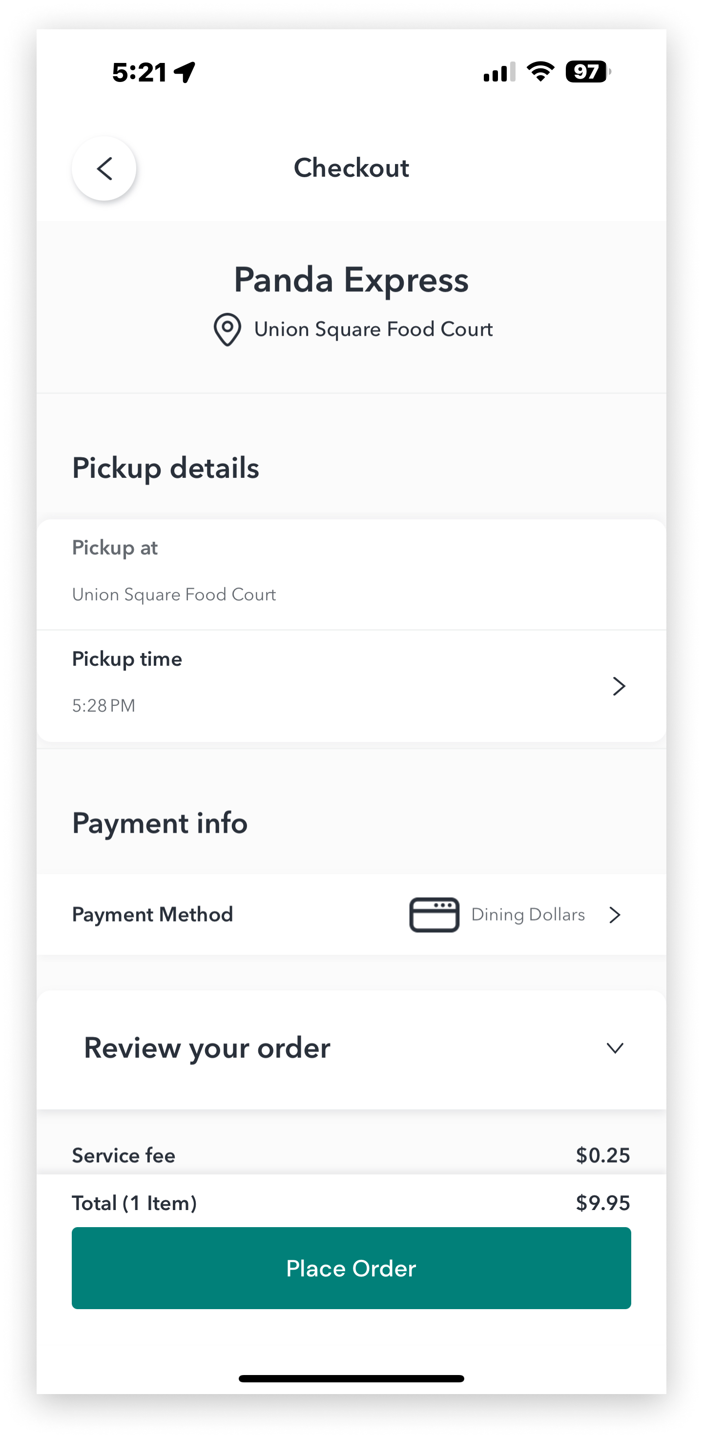
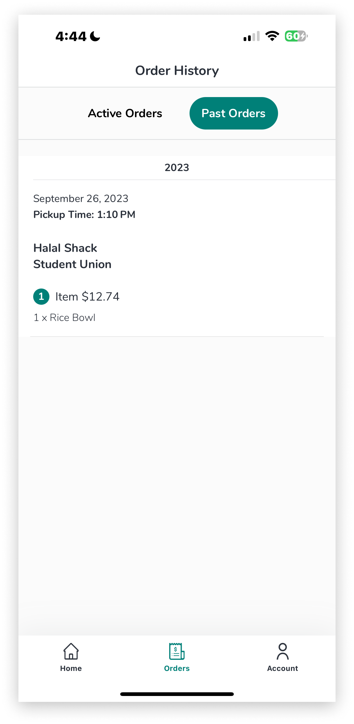
Boost: Campus Food Ordering
Minimal UI offering clear information with no unnecessary distractions
Checkout screen shows pickup location and estimated time
Past orders tab contains past order information including date and location of order
It is clear that my target users want a mobile ordering service, and this option would offer the most income growth potential for the business. Furthermore, it was easy to determine that convenience of ordering was the driving force behind having a mobile app in the first place. Therefore, a simple, intuitive UI along with the ability to work around a schedule would be necessary features to include in the app to maximize user convenience, which would in turn increase overall sales volume and revenue.
Lo-Fi Design
Initial Wireframes

These wireframes were sent out as part of a survey to 10 of the users I had previously interviewed for usability testing. I tasked my users with going through the order flow of selecting two items from the menu, customizing them and checking out. Additionally, I asked these questions:
How intuitive is it to use this app?
Did you have any issues with the process of selecting an item, customizing it and checking out?
Do you think this app is a good reflection of The AM Craft experience?
Please identify any issues no matter how small you had with the order process.
of users found the app intuitive
70%
90%
of users had no issues with the process
70%
of users felt the app was a good reflection of the brand experience
Usability Pain Points
The favorites tab lacking an order again feature for favorited items detracts from user personalization and creates a problem for users who wanted to reorder what they ordered previously, but may have forgotten the specifics of that order
Drink and pastry menus all being on one page was confusing and created a long scrolling interaction that meant it took the user too much time to get to the item they wanted
No map being incorporated into the checkout flow meant users would have to exit the app to find out where to go to pick up their order
Design Changes and Hi-Fi
Room For Improvement
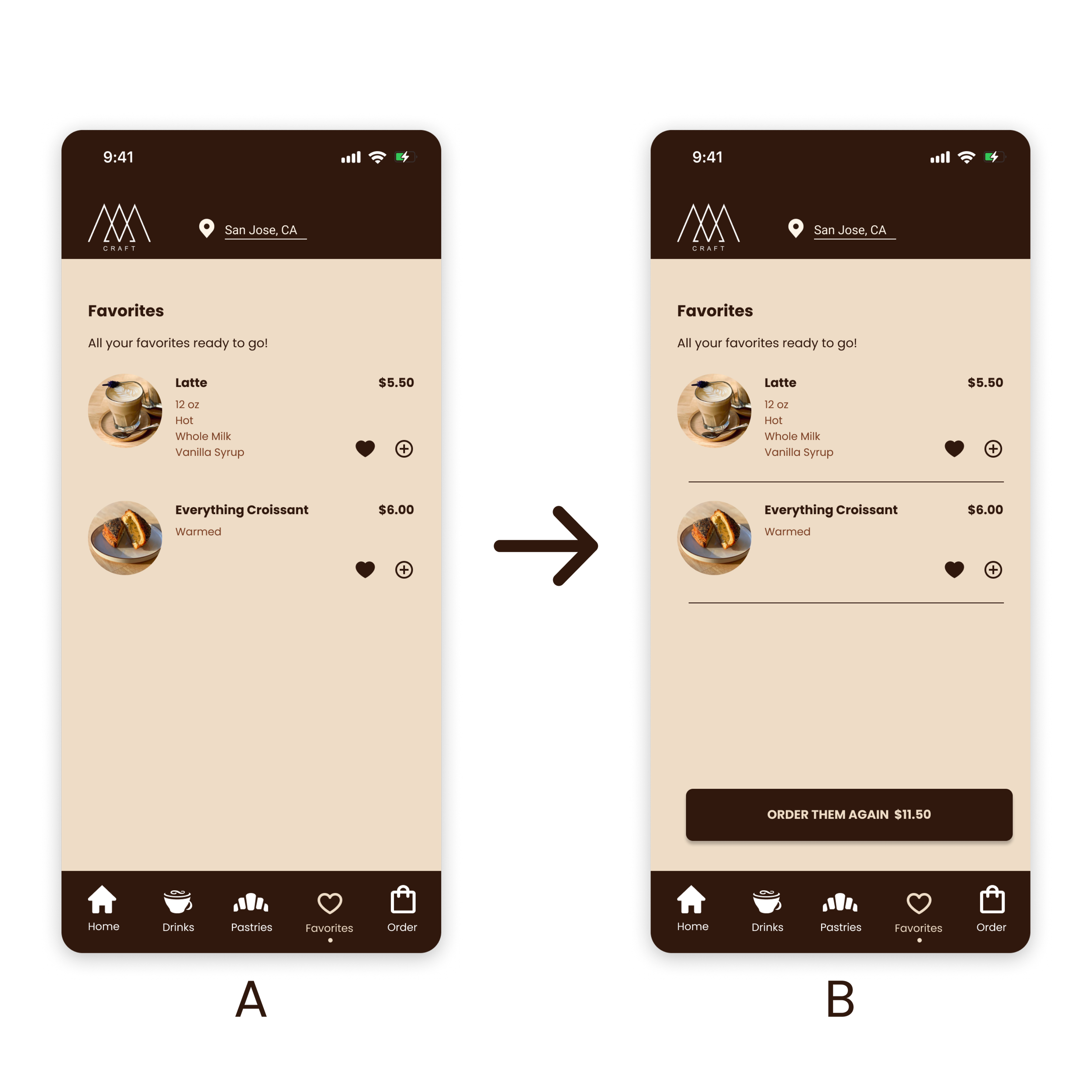
Improved Favorites Page
Order again button added to allow users to quickly re-order their favorite items with their saved preferences
Dividers between items added to make menu more legible
100% of users preferred Frame B in testing

Revamped Menu
Drink and food menus separated into different items on the nav bar
Profile tab and store locator added to the header bar
100% of users preferred Frame B in testing
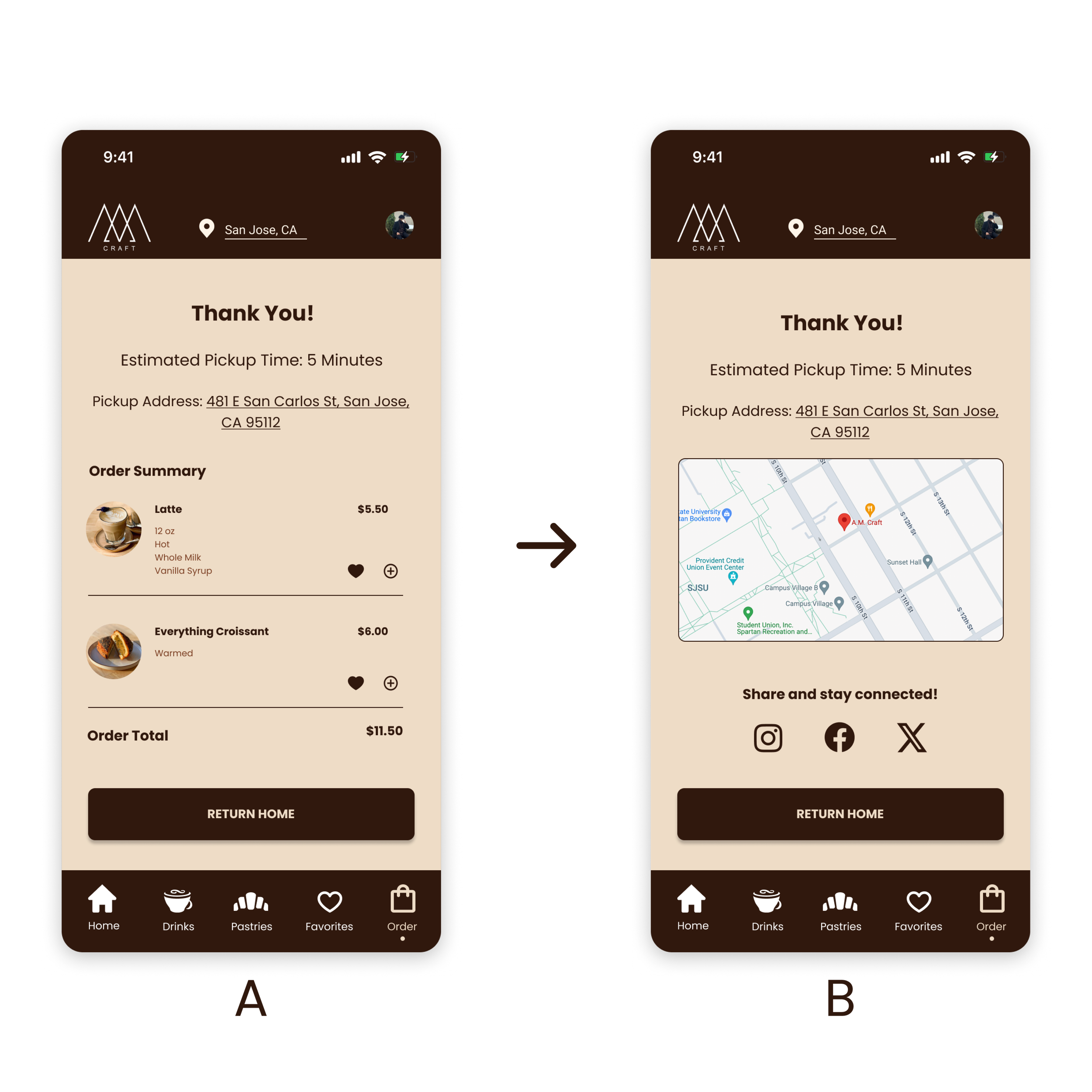
Improved Checkout Flow
Map added to checkout flow allows users to seamlessly find their store for pickup from their current location
Addition of social media links keeps the target users of the app who are more likely to be using social media connected with the brand and can promote growth through social media exposure
100% of users preferred Frame B in testing
High-fidelity solution
Final Screens
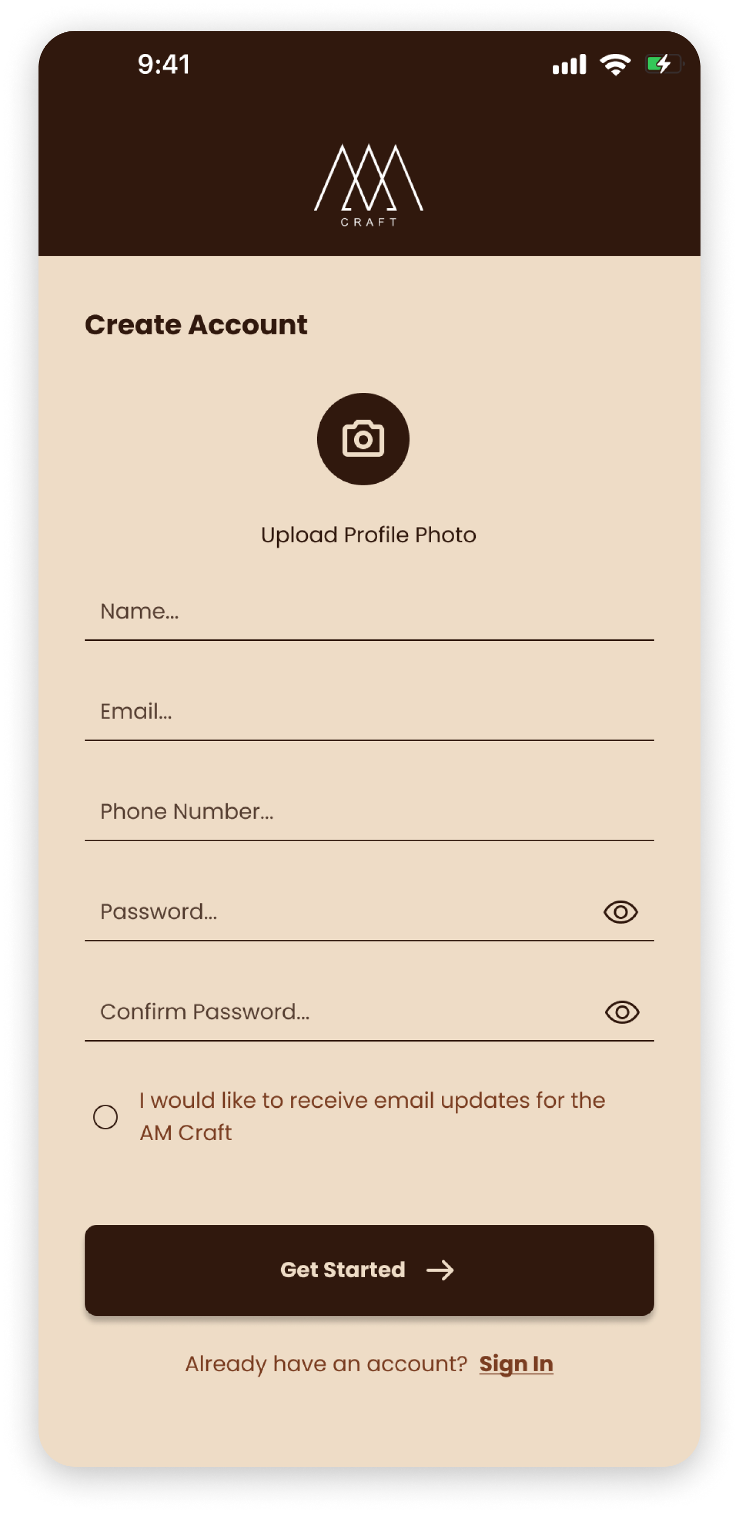
User Onboarding
An intuitive, simple onboarding process gets the user from sign up to the home menu as quickly as possible.
Once at the home screen, they can easily explore menus, change store location and order at will.


Menus and Checkout Flow
Easy to read menus with the ability to favorite an item and save preferences proved effective in increasing user engagement/retention.
The checkout flow was designed with speed scrolling in mind to create a familiar user experience that most students and those who place mobile orders are already familiar with.
Menus
Order Flow
Design adheres to WCAG AAA standards.
Evaluation
Final Design User Testing Feedback
Upon completion of 3 rounds of iteration and testing to reach my high-fidelity design, I sent out the (almost) final product with the same survey used to evaluate my initial wireframes in order to gauge improvements. Here are the results of this survey:
of users found the app intuitive
100%
of users had no issues with the process
100%
Finally, in order to make sure there no issues with my prototype and to get some live feedback, I conducted some in-person testing with AM Craft customers as well.
Additional user feedback:
“The app is very convenient and easy to use. The problems I had with it earlier are gone now.”
“The favorites tab letting you re-order the same thing will save me some time since I always get the same thing from the AM Craft anyway.”
“I like that the seasonal items are the first thing you see after logging in. The menus are organized more clearly and are easier to use than before.”
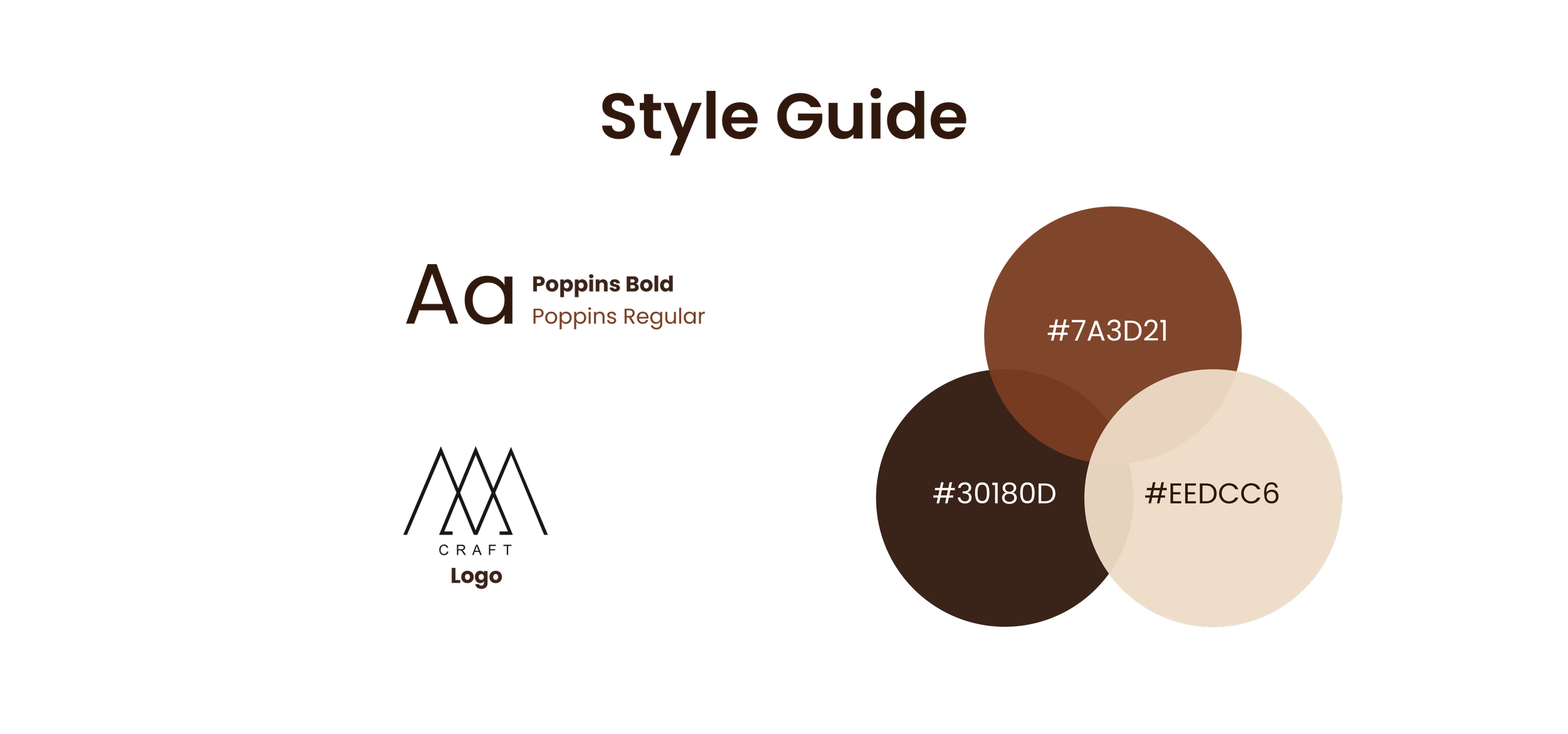
“I love the color scheme, it matches the store perfectly.”
of users felt the app was a good reflection of the brand experience
100%

Reflection
Closing Thoughts
This was a passion project I created under the guide of the business because I knew my friends and I genuinely would want to use a service like the one I created to solve our problems. The long process of researching, designing, testing and then iterating the design again led me to a project I am very proud of but I know there is still room for improvement.
What I learned
Both younger college students and older adults heavily prioritize convenience due to their densely packed schedules which can influence their purchasing habits
Users appreciate features that they are already familiar with in a new product such as order preferences, which is why it’s so important to research your competitors as well as your intended users
User research is the most important part of the design process. If your design is created by following user needs you will inevitably arrive at a solution that will leave users with a positive experience
What I can improve
Implement a feature for users to remove an item from their cart using a swipe to delete interaction
Create a rewards system for the app as research indicates a rewards program increases sales and customer retention for a business
Work with the cafe and have them send out a survey to loyal customers in order to obtain a larger sample size with more varied data to base my decisions on. My methods of user research had a relatively small sample size and I mainly only spoke to college students and a random sample AM Craft customers. Using data obtained from a cafe sponsored survey could provide many more key insights to create an even better product which addresses more user concerns.
The most important thing this project taught me was how essential being involved with your community of target users is in creating a good product. Being a good designer means not only being able to create visually appealing designs but also enhancing the experiences of your community through user focused design in products created for the benefit of the user.
Thanks for reading :)